Page layout options

There are three page layout options available when modifying a template in edit page. The page layout you choose determines the number and relative size of columns on pages that use that template. Page layouts appear differently on different devices; see the Page layouts on different devices heading below for an explanation of the differences.
The three page layout options are:
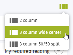
The page layout names indicate the number of columns, and the relative width of columns.
- 2 column: Narrow left column and wide right column.
- 3 column wide center: Narrow left and right columns and wide center column.
- 3 column 50/50 split: Narrow left column and medium equal width center and right columns.
If you switch from a 3 column layout to a 2 column layout, any cards in the right column will be moved to the bottom of the wide right column.
Page layouts on different devices
ThoughtFarmer has a responsive design that automatically adapts to the size of device that the intranet is being viewed on. Here is a summary of how the layouts appear on different devices:
- Desktop: All columns display. The left column can be collapsed/expanded by clicking the chevron icon on the left of the main/center column content.
- Tablet: Depending on the size and orientation of the device, the left column may display or be hidden. If hidden, it expands from the left when you tap the hamburger icon (three horizontal lines) that appears at the top left on the App Toolbar. Center column content displays with right column content below it.
- Smartphone: For all layouts, the left column is hidden, but expands from the left when you tap the hamburger icon (three horizontal lines) that appears at the top left on the App Toolbar.
- 2 column layout: the right column displays.
- 3 column layouts: the center column displays; right column content displays below center column content.
Setting up cards does not affect layout
When a user that does not have permission to modify templates sets up the cards in edit mode, they are not able to change the layout of the page. They can only modify the content of the cards that appear on the page. For more information on modifying individual templates and who has permission to do this, see How to modify templates and Content template permissions.
Comments
2 comments
Does anyone know how to create a gap/break or some white space between the Body card and the Group card? The Group Members heading/title is butting up RIGHT against whatever card is above it.
Hi Michelle,
That definitely doesn't look right - I wonder if there could be some hidden CSS or other formatting that is causing the Group Members card to sit so tightly against the grid nav. I would suggest opening a Support Request on our Helpdesk so that Avner or Oscar can take a look at this for you.
In the meantime, adding an (empty) Body or Rich Text card between the grid and group members may create a bit more space.
I hope that helps!
Carolien
Please sign in to leave a comment.