Templates
What is a template?
A template is a selected layout and arrangement of cards that is available for a particular content type. (To learn more about cards, see the pages Overview of cards and How to set up cards.) It determines the options available to you when you create a certain content type. A template is made up of cards that are universal to all pages, such as the Left Navigation card and Page Header card, and cards that are useful to particular page types, such as the Group members card and Forum statistics card.

Each content type in ThoughtFarmer comes with at least one default template. Most of the common content types can have more than one template. The templates on your intranet have most likely been customized by your intranet administrator for your organization. If there are multiple templates available for a content type, you can choose which one you want to use when you are creating a page.
Some users may be given permission to modify templates at the individual page level. Modifying a template allows a user to add and remove cards, and change the order and placement of cards on the page. To learn more, see How to modify templates.
How to select a template
Since each content type has different templates, you must choose your content type before you can select from the applicable templates. (To learn more, see Learn about content types.) Some content types only have one template, in which case the Template box will display the template name, and it will not have a dropdown menu.
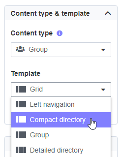
- In Edit mode, click on the Content type box, and select the content type you want from the dropdown menu.
- Click on the Template box, and select the template you want from the dropdown menu.

Compare templates
Most of the common content types can have more than one template.
Templates can be unique in these ways:
- Page layout: Templates can have 2 or 3 columns, and different column widths are available for 3 column layouts.
- Available cards: Templates may differ in the cards that are available to use on the page.
- Card placement: Available cards may be in different columns or a different order.
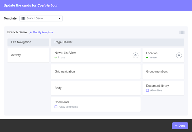
Once you have selected a content type and template, you can click on Set up cards below the template name to open the Update cards window. In this window you can see whether the template has 2 or 3 columns, the relative width of the columns, what cards are available in the template, and the column placement and order of the cards.
You can switch back and forth to compare templates in the Update cards window. To do this, click on the existing template at the top of the window to open the Template dropdown menu, and select a new template.
The Update cards window is also where you add information to cards that require setup. (To learn more, see How to set up cards on a page.) If you have permission to modify individual templates, you also do that in the Update cards window. (To learn more, see How to modify templates.)
Common cards on templates
For a basic introduction to cards, see Overview of cards.
You will see these two cards on all pages. They cannot be moved or deleted from page templates.
- Left navigation: Also know as the SuperNav, this navigation shows you the tree path to the current page and allows you to navigate through the entire site to find the page you want. On some page types, the left navigation also includes search and filter functions for the current page and its child pages. It may or may not be on the homepage.
- Page header: Present on all pages except the homepage, the page header contains the page title, an image if one has been added, and the expandable Page controls and Page sharing buttons.
- Activity: Displays activity taking place on the page and pages below it - such as new pages, document uploads, and comments. Users can add updates to the page's activity or add to discussions in progress by commenting in the activity feed. On Group pages, displays Updates and Shout-outs sent to the group.
- Body: Anything you add in the Rich Text Editor on Edit page will show up in the Body card on the page.
- Comments: Allows users to leave comments on the page. Where the Comments card is included in a template by default, the option is available to allow or disallow comments.
- Compact directory navigation and Detailed directory navigation: Navigational cards that display child and grandchild pages in slightly different ways.
- Document library: Allows users to attach files to the page. Where the Document library card is included in a template by default, the option is available to allow or disallow file upload.
- Grid navigation: Displays subpages in a grid as thumbnail images captioned with page titles.
- News: Displays posts from selected News, Blog, Forum or Calendar pages in list or grid view. For more information, see How to use a News card.

Comments
0 comments
Please sign in to leave a comment.