Page header image guidelines
Image guidelines for page headers
For information on page header settings, see Page header images.

Page header image height is dependent upon screen width and the length of the page title. The images you upload for page headers will always fill the width of the image area. This means that small images will stretch proportionally to fit the width, and larger images will shrink proportionally to fit the width.
A minimum image size of 1200 pixels in width and 700 pixels in height is recommended. Be aware that only a portion of the image will show in most instances.
Adjust the safe area to choose which part of the image will always display: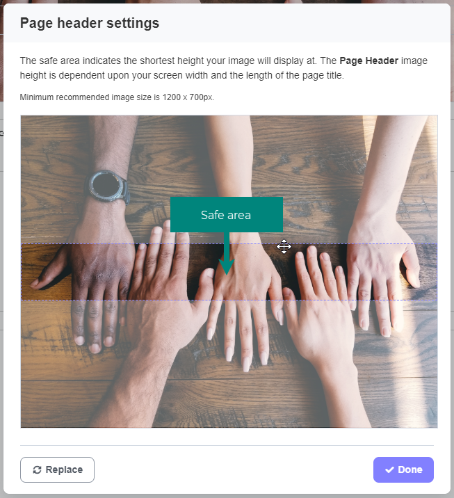
By default, the absolute centre area of the image/photo will always be visible. However, you can customize what area of the photo always shows. When you add a new page header image, or edit an existing one, you will be presented with the Page header settings pop-up window. In this window, you can select the "safe area" of your image, or which part of the image will show even when the image is at the shortest height it can display at.
Screen or device width affects area of image shown
Depending on the width of your screen, you may see more or less of your image vertically. This means that the part of the image that shows in the page header will be different on a desktop, a tablet, and a smartphone - as pictured below.
The pink rectangles on the following images represent the approximate area of the image that will show in the page header.
Desktop - full image showing area that shows in page header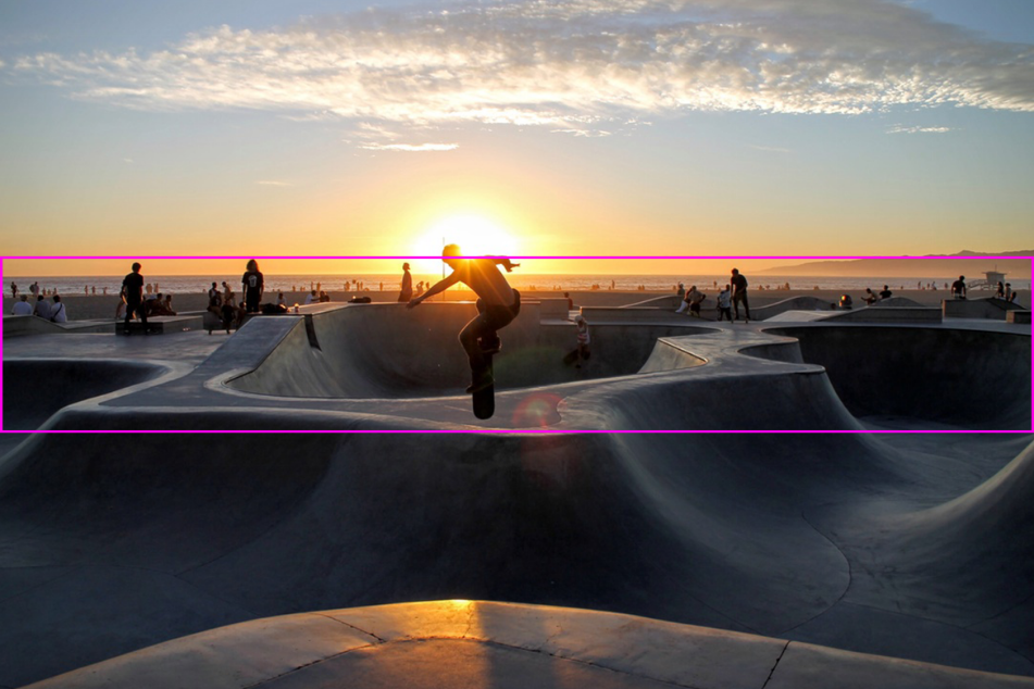
Desktop - image as it appears in page header
At the widest width, page header images are 1170 pixels in width by approximately 200 pixels in height.
The height of the page header image area stays the same the narrower your page gets. This means you see more of your images vertically as the page width decreases.
Tablet - full image showing area that shows in page header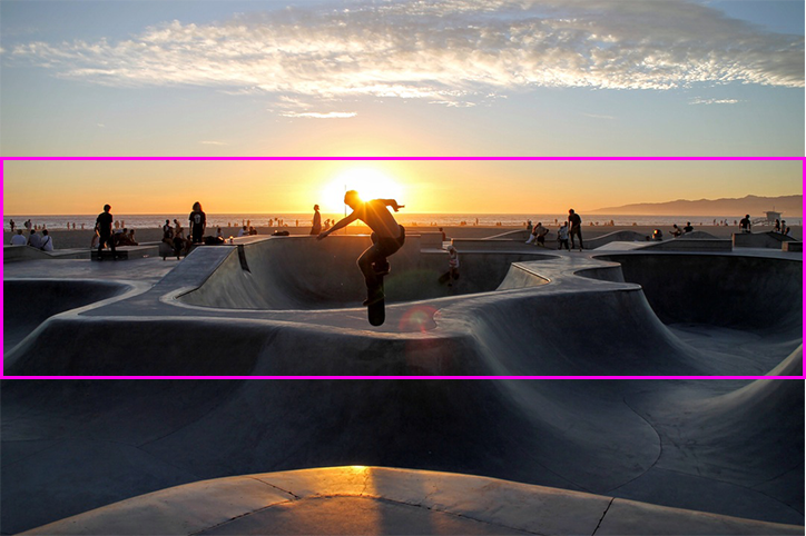
Tablet - image as it appears in page header
Mobile - full image showing area that shows in page header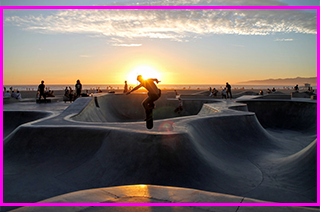
On mobile you can see nearly the entire image (if it is a landscape-oriented photo).
Mobile - image as it appears in page header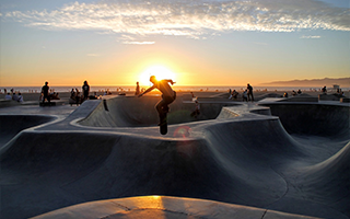
Portrait versus Landscape
No matter what the orientation of your page header image, the area of the image that shows in the page header by default is still the absolute center of the image.
Desktop - full image showing area that shows in page header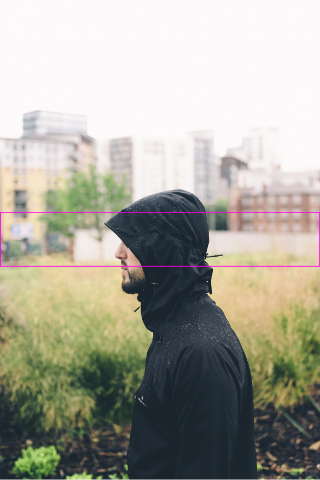
Desktop - image as it appears in page header
Tablet - full image showing area that shows in page header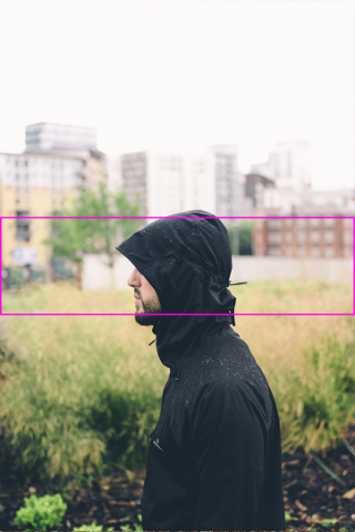
Tablet - image as it appears in page header
Mobile - full image showing area that shows in page header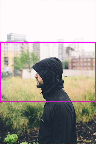
Mobile - image as it appears in page header
Recommended dimensions
The recommended minimum image size for page header images is 1200 pixels in width by 700 pixels in height.
Due to the responsive nature of ThoughtFarmer, we don't recommend choosing page header images based only on the size of the safe area of the page header image. As seen above, more of the image displays when viewed on a smaller screen, such as a tablet or mobile phone. If the uploaded page header image is too short, it will stretch the image to fill the full background area for certain screen widths.

Comments
0 comments
Please sign in to leave a comment.