Colors

The Colors section contains color selections for buttons, accents, status indicators, and various backgrounds and fonts. Some color settings are located with their respective features in other theme sections. To access the options on this page, go to the Admin panel: User interface section > Theme page, select the theme you want to edit and click on the Colors section.
Colors are populated based on the primary and secondary colors that you choose when initially creating a new theme. Previews of the selected colors show adjacent to the various theme elements and will update as you choose different colors.
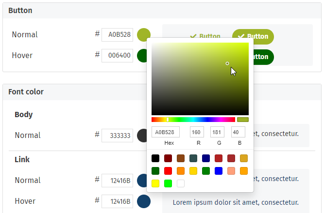
Colors can be specified by entering a Hex color code for the desired color in the # field beside the theme option (to learn more about color codes, see HTML Colors). You can also pick your own custom colors by clicking on the current color associated with a particular theme element to open the color picker. In the color picker you can select a color from the color customizer, enter a Hex or RGB color code, or select a preset color. To close the color picker without making changes, just click outside of the color picker box.
The preview on the right will update immediately with your color selections to give you an idea of what your colors will look like when applied to the intranet.
Bulk color change
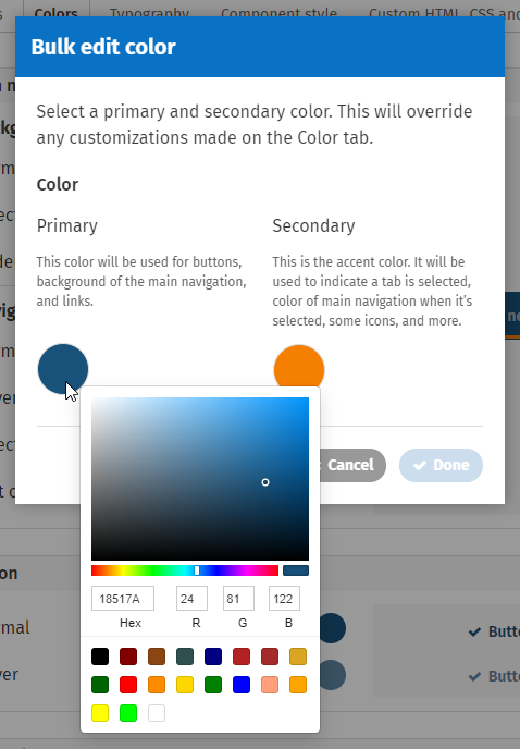
This feature (found in the top right of the Colors section) allows you to completely change the look of the theme by only selecting two new colors. The Primary and Secondary colors you select will be applied to different parts of the interface. Experiment with a different color scheme easily. Choosing new colors through the Bulk edit color window will override any customizations made on the Colors tab.
- The new Primary color will be used for buttons, the background or links of the main navigation, the background of broadcast banners, and links. Another color is calculated from the primary color for the hover color of buttons and links.
- The new Secondary color will be used as the background or text when a tab or part of the main navigation is selected, and as the site accent color.
Some colors are not affected by Bulk edit color, such as the body font, page header backgrounds, status indicators and news item background.
To change the Theme colors in bulk using Bulk edit color:
- Click Bulk edit color in the top right of the Colors section of the Theme editing page. The Bulk edit color pop-up window will open showing the current Primary and Secondary colors.
- Click the current Primary color shown in the window to open the color picker. Select a color from the color customizer, enter a Hex or RGB color code, or select a preset color. Click outside the color picker to close it.
- Click the current Secondary color shown in the window to open the color picker. Select a color from the color customizer, enter a Hex or RGB color code, or select a preset color. Click outside the color picker to close it.
- Click Done. The colors on the color tab will be updated based on the new Primary and Secondary color you selected.
- Click Save in the top right to save the bulk color changes you have made, or click Cancel to revert back to the previous colors.
Button
Where the button field colors are applied:
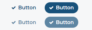
- Normal: Background of action buttons, or action text, on the site and in pop-up windows. Header color of pop-up windows. Color of icons in edit mode.
- Hover: Buttons, action text and certain edit mode icons turn this color when the user hovers over them.
Font color
Where the font color field colors are applied:
Body
- Normal: Many areas of text - includes page body content, comments, text in Cards.
Link
Normal and Visited links can be the same color value, or different values. As an example, you can check your organization's public website to see how links are treated there.
- Normal: Links in body copy, Activity streams and other cards; user profile links in News; current page in the SuperNav.
- Hover: Links turn this color when hovered over.
- Visited: Links in body copy turn this color when the user has visited them.
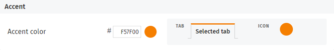
Accent
The site accent color is used for certain small components on Cards such as Carousel and Mini Calendar. It is also used to underline the selected tab in the App Toolbar and Activity Cards.
Page header background
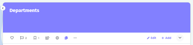
The page header background colors can be selected for page headers using these page header formats: Image with title overlay, Image with title separate, and Line. The default Theme page header colors are the same regardless of which primary and secondary colors you select when you first add a theme. The page header background colors can be changed as desired by entering Hex color codes or using the color picker.
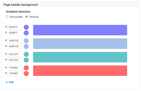
There will always be at least four page header background colors to select from, but you can add more background colors for users to choose from on edit page.
Each color option lets you add two colors selections. Choosing different colors for the two selections will create gradient page header backgrounds. If the same color is selected for both color selections, the headers will be a solid color instead of a gradient. You can create horizontal or vertical gradients by selecting the radio button for the desired Gradient direction.
If you want to use the Image with title overlay page header format, be sure that every page header background color or gradient works with the page header text color set on the Typography tab of the Theme panel.
See Page header images for settings that control using images and photos from galleries in page headers.
Status indicator
Status indicators show beside page titles in the left navigation and search results to indicate that pages are Private, to be published in the Future, recently Updated, or New. The default status indicator colors are the same regardless of which primary and secondary colors you select when you first add a theme. The status indicator colors can be changed as desired by entering Hex color codes or using the color picker. The colors chosen for the indicators often need to work on white and light grey backgrounds.
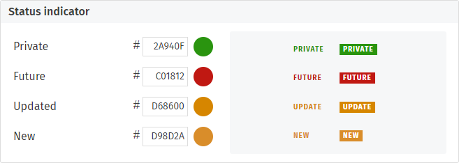
Where the status indicator field colors are applied:
- Private: Text/background color of the label Private (shows in the left navigation and search results beside the page title of pages whose security settings are set to private).
- Future: Text/background color of the label Future (shows in the left navigation and search results beside the page title of future published pages before the published date).
- Updated: Text/background color of the label Updated (shows beside the page title of updated pages for the time period specified by the config setting dates.maxAge.updatedItem).
- New: Text/background color of the label New (shows in the left navigation and search results beside the page title of new pages for the time period specified by the config setting dates.maxAge.newItem).
News item background
The News item background color shows in place of an image for news posts that don't have a thumbnail image that are displaying in News: Grid View and News Carousel. The news item background color can be changed as desired by entering a Hex color code or using the color picker.
News post: Grid title separate layout
There is a gradient overlay on the News item background when Grid - Title overlay format is selected. This helps text legibility when images are used. The color used here will appear darker due to this overlay.
News post: Grid title overlay layout
Broadcast banner colors
The broadcast banner colors are used when a broadcast is sent that includes displaying a banner at the top of intranet pages. By default, the banner is the same color as the primary color selected for the theme. It can be customized using the color options described below. To learn more, see Broadcasts.

- Background color: Used for the background of the broadcast intranet banner.
- Text color: Used for the text of the broadcast in the intranet banner.
Comments
0 comments
Please sign in to leave a comment.