Component style
The Component style section contains theme options for various site components, including the site background, layout, footer and default images. To access these options, go to the Admin panel: User interface section > Theme page, select the theme you want to edit and click on the Component style section.
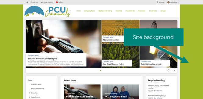
Site background
You can choose an image or color to display as the background of your site if you wish. The site background appears behind the header, main navigation, site container, page cards and content. Depending on your site header selections, it can also show as the background of the site header. Depending on device width, the site background may show on the left and right of the page behind the cards and content.

To upload a site background image, Drag and drop or Browse to upload your image file. (Click Replace if there is already an image uploaded.) Accepted file formats are gif, jpg, and png.
There are four site background image treatment options to choose from once you upload an image: Align top center, Align top left, Repeat horizontally and vertically, and Repeat horizontally along the top. After you upload an image, you can select the radio button for these options to view a preview of how this will affect how the image displays.
For non-repeating options, the image must be a minimum size of 2560(w) x 1440(h) px. The site background image should be high enough resolution to appear crisp, but a small enough file size not to affect the speed of the intranet. The average size of screen the site will be viewed on will also help you to determine the minimum size for the background image.
Background color: This color displays in areas of the background not covered by a site background image. You can choose a color for the site background, select the level of color opacity (using the transparency slider in the color picker), or make it completely transparent (in which case the site container does not show and the site background color or image shows instead).
Gradients
Background gradients can be achieved by creating a small image of the gradient effect you want and selecting one of the two repeat options under Image treatment (options appear once an image is uploaded to the Site background section).
If you want to have control over the gradient height so it remains consistent on every page, regardless of the page length, create your image at 10px wide by 1440px tall (or however tall you wish) and choose Repeat horizontally along the top. This will repeat the gradient image horizontally for the full width of any screen, but not vertically, allowing the gradient to blend seamlessly into the background brand color that you’ve set to be the same as the bottom color of your gradient.
Layout
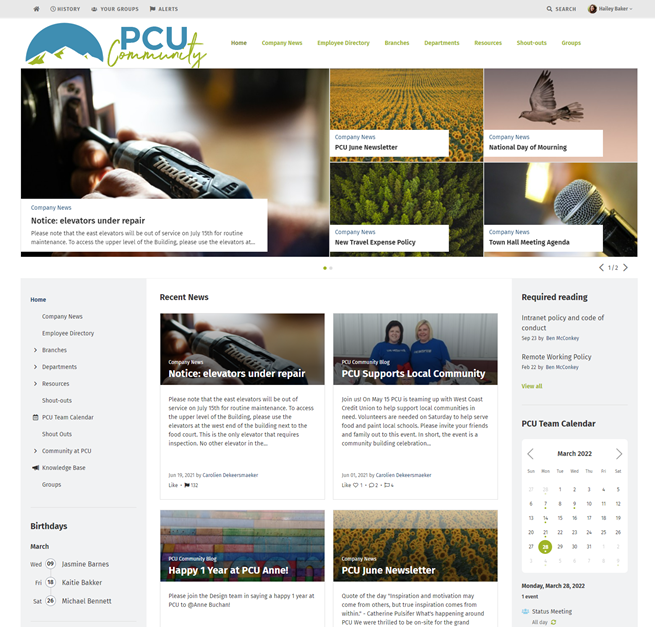
You can choose between two layouts for your intranet: Block and Column. In Column layout, individual cards meld together into the columns that they live in, and the columns are more distinct than the cards. In Block layout, individual cards are distinct from each other on the page.
Block layout

Column layout

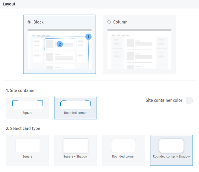
Block layout has multiple options that Column layout does not. When you select Block layout, you'll see options for the site container shape and color, and for the shape and border of cards.
- Site container: The site container is an area that overlays the site background between the header and the footer, and displays behind cards on the page. It contains the area of the site in which cards display. You can select square or rounded corners for the site container. Note that if rounded corners are selected, they will display on the desktop version, but the mobile version will display square corners.
- Site container color: You can choose a color for the site container, select the level of color opacity (using the transparency slider in the color picker), or make it completely transparent (in which case the site container does not show and the site background color or image shows instead).
- Card type: There are options to choose for the appearance of cards. You can select square or rounded corners, either with a border or with a shadow around the card. Note that if rounded corners are selected, they will display on the desktop version, but the mobile version will display square corners.

When upgraded to 10.5+, the layout defaults to Column. Column is the legacy layout, displaying the same way as previous versions. For new intranets, the default layout is Block, with a square site container, square card type, and light grey default background color.
Footer
The footer is the informational area below all page content.

- Image: As with the header, you may specify a background image to display. Drag and drop or Browse to upload an image to display in the footer. (Click Replace if there is already an image uploaded.) Minimum size in pixels is 2560 width x 51 height if the option "Extend footer to edges of browser" is selected. If that option is not selected, then minimum size is 1470 width x 51 height. Accepted file formats are: gif, jpg, and png.
- Background color: This color displays in areas of the footer not covered by an image. Select a color from the color picker.
- Text color: Select a color for text in the footer from the color picker.
- Link color: Select a color for links in the footer from the color picker.
- Border: To add a border to the footer, add a width in pixels and select a border color from the color picker.
- Extend footer to edges of browser: Selecting this checkbox will extend the footer to the edges of the browser regardless of the site width.
Default images
If a user has not added a profile picture, or a group page does not have a thumbnail image, default profile and group images will display on profile pages, in the People Directory, in the Groups Directory and in search results. You can upload your own default images for profiles and groups.
Profile image
-
Drag and drop or Browse to upload an image that will appear on profile pages, the People Directory and search results when a user has not uploaded a profile picture. (Click Replace if there is already an image uploaded.) The image must be a minimum of 500px width and height. Accepted file formats are gif, jpg, and png. If you don't upload an image, the user's initials will show as their profile image.

Group image
-
The Group image field is populated with a default group image that appears on the Groups Directory and in search results when a group page has no image added to it or set as the thumbnail image. Click Replace to use a different image. Then Drag and drop or Browse to upload a new image. The image must be a minimum of 500px width and height. Accepted file formats are gif, jpg, and png. If you don't upload a new image, the default Group image will be used.


Comments
0 comments
Please sign in to leave a comment.