Navigation and header

The Navigation and header section contains theme options related to navigation and the site header, including the app toolbar, main navigation style, site header background, and header sub image. To access these options, go to the Admin panel: User interface section > Theme page, select the theme you want to edit and click on the Navigation and header section.
App toolbar

The App toolbar shows at the top of every page and contains many useful links and menus. You can choose a light theme or a dark theme for the app toolbar, and select the background color for each option. The light and dark options have a neutral black or white color for the icons and text that provides good contrast to the background color. Select the radio button for the theme that you want, and enter a HEX color code in the corresponding background color field, or click the color circle to open the color picker.
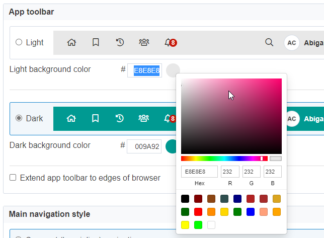
The dropdown menus from the app toolbar will have a light background whether you pick a light or dark background for the app toolbar itself.
Extend app toolbar to edges of browser
When this checkbox is selected, the icons on the app toolbar will display starting at the edges of the browser regardless of site width.

When this checkbox is not selected, the icons on the app toolbar display starting at the edges of the site container regardless of browser width.
For either selection, the background color of the app toolbar extends to the edges of the browser.
You can customize the appearance of the toolbar further using Custom CSS under the Custom HTML, CSS and Javascript tab on the Theme page. See Custom HTML, CSS and JavaScript for more information.
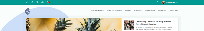
Main navigation style
There are two main navigation styles to choose between: Compact (logo inline) navigation and Bar navigation. The main navigation shows on every page of your ThoughtFarmer intranet.
Compact navigation: Navigation links appear in the site header, to the right of the site logo. By default, the navigation links are left justified, but there is an option to right justify them. If there are more navigation links than will fit on one line, a More link automatically appears on the right of the main navigation bar which expands to a dropdown menu with the additional top level pages.
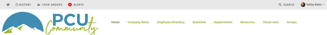

Bar navigation: Navigation links appear below the site header and logo, and above page content. If there are more navigation links than will fit on one line, the bar navigation wraps to a second line. (To avoid the navigation wrapping, see the heading "Show/hide top level pages..." on Main navigation bar.)

You can specify colors for the main menu and child menu background and text for both navigation styles. Navigation links can be in all capitals, or using the capitalization used in the page title. Main navigation background and text can have colors chosen for their normal, hover and selected states. A navigation link is "selected" when you visit the page the link takes you to, or any content underneath that page.
As you select colors for the main navigation on the theme page, the preview will update to show you how the colors apply to the main navigation.
Main menu background
We recommend not selecting different colors for each of the Menu bar, Hover/Selected and Underline options. For instance, you could select the same colors for the Hover/Selected and Underline colors.
- Menu bar: Color of the main navigation background when not selected.
- Hover (Compact navigation): Color of the main navigation background when hovered over.
- Selected (Bar navigation): Color of the main navigation background when selected - a navigation link is "selected" when you are visiting the page the link takes you to, or subpages of that page.
- Underline:
- Compact navigation: Underline color at the bottom of a main navigation link when it is hovered over and has a child menu.
- Bar navigation: Underline color at the bottom of a main navigation link when it is hovered over or selected.
Main navigation text
- Normal: Color of the main navigation text when not selected or hovered over.
- Hover: Color of the main navigation text when hovered over.
- Selected: Color of the main navigation text when selected - a navigation link is "selected" when you are visiting the page the link takes you to, or subpages of that page.
- Text option: Letter case of the main navigation text. Select the radio button AA to display main navigation links in all capital letters. Select the radio button Aa to display main navigation links with the capitalization used for the titles on the individual pages.
Child menu background
- Color: Background color of a child menu displayed off the main navigation.
Child navigation text
- Normal: Text color of the child navigation text when not selected or hovered over.
- Hover: Text color of the child navigation text when hovered over.
- Selected: Text color of the child navigation text when selected. A child navigation link is "selected" when you are visiting the linked page.
- Text option: Letter case of the child navigation text. Select the radio button AA to display child navigation links in all capital letters. Select the radio button Aa to display child navigation links with the capitalization used for the titles on the individual pages.
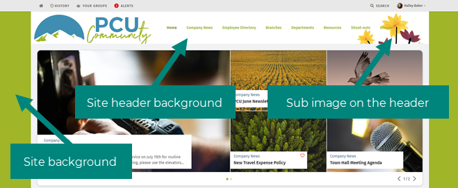
Site header background
The site header is the area on the page below the app toolbar and above the page content or main navigation (bar navigation style only).
- Image: Drag and drop or Browse to upload an image to display in the header section. Minimum image width is 1470 pxs. Image height is flexible but needs to be accommodated by the background overall height setting. Accepted file formats are gif, jpg, and png.
- Background color: This color displays in the background of the site header. If you are using a full screen background, you can choose the transparent color swatch to make the header transparent.
- Overall height: Adjust this value to set the overall height of the header in pixels. This needs to be adjusted to accommodate the size of the site logo added on the Logos tab, and the site header background image above.
- Border: To add a border to the header, add a width in pixels and select a border color from the color picker.
- Extend header to edges of browser: Selecting this checkbox will extend the header to the edges of the browser regardless of the site width.
(Site background options are found under the Component style section of the theme.)
Sub image on the header
- Image: Drag and drop or Browse to upload an image to display on the far right of the header section. (Click Replace if there is already an image uploaded.) This image overlays the site header background, but does not overlay compact main navigation colors. Minimum image width is 280 pixels. Image height is flexible but needs to be accommodated by the background overall height setting under the Site header background section. Accepted file formats are gif, jpg, and png.
- Sub image margin: By adjusting the top and right margins you can change how close the sub image is to the top right corner of the header. Enter margin values in pixels. Note that the right margin is from the edge of the sub image to the edge of the page content, not the edge of the page background (as the background width may change depending on screen resolution). See Site logo for an example image of margins in the header.
Comments
0 comments
Please sign in to leave a comment.